Darkroom Daylight
The design system of a photographic travel archive: warm paper, quiet ink, one amber accent, and photographs that always come first. This page is built from the site’s own stylesheet and components, so what it shows is what the site does.
Principles
Colour
The public site’s palette. Click a colour to copy its value. Contrast is measured against Paper, the page colour; text needs 4.5:1 (AA) and large text 3:1.
Core
Regions
Each region of the world has an ink, used for its dot on a filter chip, its stamp on a map and the rule on its letters. The count is how many countries the site files there today.
Typography
Everything: navigation, headlines, prose, labels. A clean grotesque that stays legible at the small, widely tracked sizes the labels use.
Pull-quotes only — the one place a voice is lifted out of a letter. Italic, so a quote never reads as a heading.
The scale
Each line below is set by the site’s own class; the measurements beside it are read from the page as you look at it.
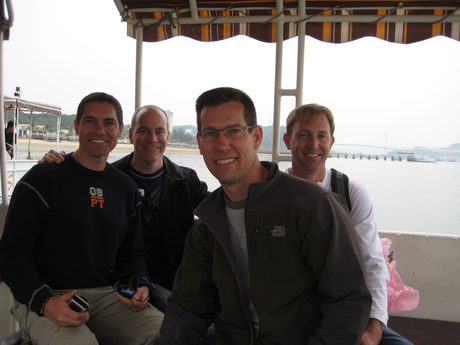
Vietnam 2009 — Halong Bay
.gmhead h2Countries
.dochead h1.wordmarkLetters home — the journal
.sect-head h3.regionlabMoi declared today a public holiday so there aren’t any Air India flights leaving today, let alone the fact that no one at the airport was answering the phone anyway. We ended up just hanging around the Kumuka compound watching the only Kenyan television station for any election…
.jbody p.pull.gmhead .subLayout
One column, at most 1200px wide, centred on the paper. Content sits 36px in from its edges on a wide screen and 20px in from the screen’s edges on a narrower one. The site changes shape at these points:
Desktop and a landscape tablet at full width: a 1200px column, 36px gutters, the left admin rail.
Gutters close to 20px, grids drop a column, the admin rail becomes group chips.
The masthead stacks (wordmark centred, sections under a hairline), photo pages go full width, the admin menu becomes a bottom tab bar.
The section names tighten to fit one line down to a 375px screen.
The photo stage (the photograph fills the window) and the contact sheet (big tiles, edge to edge), whichever way it is held.
Touch targets are at least 44px on a phone or iPad. Nothing on a public page scrolls sideways, at any width.
Every screen-size rule in the stylesheet (21)
| Condition | Rule blocks |
|---|---|
(max-width:700px) | 15 |
(max-width:760px) | 6 |
(max-width:900px) | 4 |
(pointer:coarse) | 4 |
(max-width:640px) | 3 |
(max-width:560px) | 2 |
(pointer: coarse) and (min-width: 701px) and (min-height: 501px) | 2 |
(max-width:1000px) | 1 |
(max-width:1024px) | 1 |
(max-width:480px) | 1 |
(max-width:600px) | 1 |
(max-width:620px) | 1 |
(max-width:700px),(pointer:coarse) and (max-height:500px) | 1 |
(max-width:899px) | 1 |
(min-width:701px) | 1 |
(min-width:701px) and (max-width:1024px) | 1 |
(orientation: landscape) and (max-height: 500px) | 1 |
(pointer: coarse) and (min-width: 701px) and (min-height: 501px) and (max-width: 1100px) | 1 |
(pointer: coarse) and (min-width: 701px) and (min-height: 501px) and (orientation: portrait) | 1 |
(prefers-reduced-motion: reduce) | 1 |
(prefers-reduced-motion:reduce) | 1 |
Components
The pieces every page is built from, drawn here with the site’s own markup. Each one says what it is for and links to a real page that uses it.
Masthead
The wordmark and the five sections, on every public page. On a phone the wordmark centres on a line of its own and the sections sit beneath a hairline.
The home page →Breadcrumb & way back
Where you are, and the one step out, at the top of every inner page.
An album page →Buttons & chips
Amber fills for the one action on a screen; an outlined amber for the way back; round chips to filter a list. A chip’s dot is its region’s ink.
The Photographs index →Country cards
A country’s cover photograph, its name, years and albums, grouped under its region’s heading.
Countries →Album row
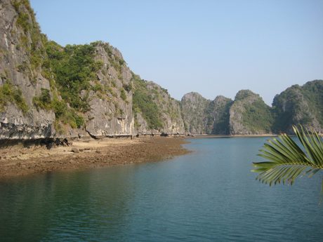
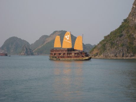
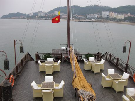
An album’s year, place and count, its strip of four photographs, and a badge when it has films.
Vietnam’s page →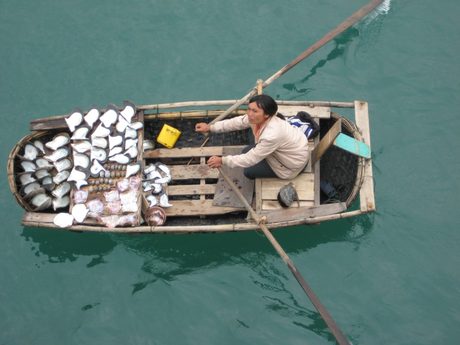
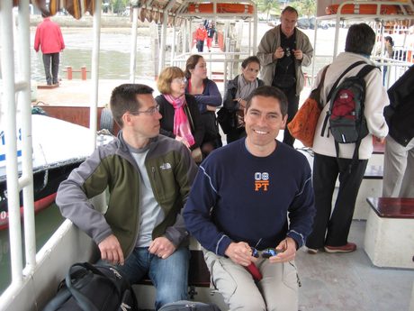
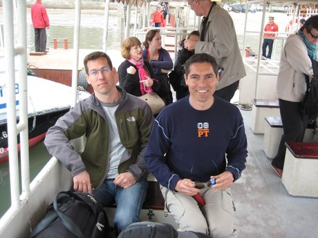
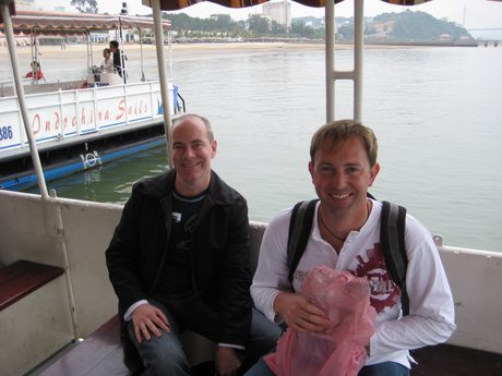
Photograph grid
An album’s photographs, in rows of one height with nothing cropped on a computer; on an iPad a contact sheet of big tiles, edge to edge.
Halong Bay →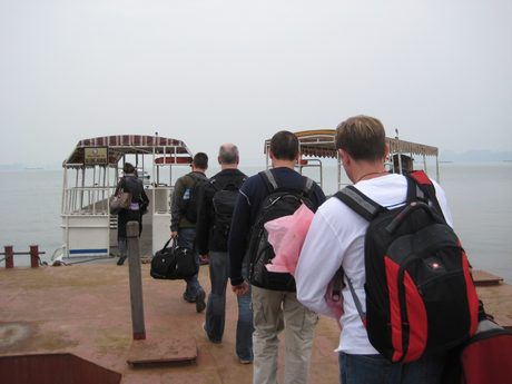

Film card
A poster, its length, its title and a line about it. Pressing play fills the screen; a swipe moves to the next film.
A films page →Landing in Cambodia
A letter
The journal’s prose: a generous measure, a drop capital on the first paragraph, and a pull-quote set in Fraunces. Quoted from Election Day – Nairobi, Kenya.
That letter →Moi declared today a public holiday so there aren’t any Air India flights leaving today, let alone the fact that no one at the airport was answering the phone anyway. We ended up just hanging around the Kumuka compound watching the only Kenyan television station for any election…
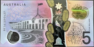
Banknote card
A note’s value and currency, its front and back side by side, and the way into its page.
Dollar notes →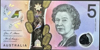
Friends band
Across the top of every page for a signed-in friend: the one place the friends’ purple appears.
The friends door →Every component file (12)
Listed from the code itself: each component and page frame, what it says it is, and how many pages build on it. A new one appears here the next time the site builds.
The admin door's single login, at the foot of the nav column
Used by 1 fileUnlisted albums, shown on a public listing page to whoever holds the admin passphrase — and to nobody else
Used by 2 filesThe album page — both views (matted photograph + filmstrip, and the place-sectioned gallery grid), the friends-only weave, Share with a friend, and the admin verbs
Used by 2 filesOne album on a country's timeline — the .exrow card (year, name, count, Album →, four-thumbnail strip)
Used by 4 filesThe breadcrumb in every admin page's top bar, as links
Used by 16 filesThe admin door's nav, shared by the manual pages, the tool pages and the hub
Used by 12 filesUnlisted films, shown on the films pages to signed-in friends — and to nobody else
Used by 2 filesThe frame both insights dashboards sit in
Used by 2 filesA picture that fills its tile — the <img> inside a card, a strip cell, a film poster, a journal row
Used by 9 filesThe frame of every page: the head, the masthead, the footer, and the band a signed-in friend sees.
Used by 33 filesThe frame of the manual's pages: the admin menu beside a reading column.
Used by 5 filesThe frame around every /guides page
Used by 3 filesPhotographs & media
What the site asks of what it is sent. These are the limits the import pipeline enforces, read from it.
- Shown at up to 2048px on the long edge; larger files are brought down to it.
- A phone is shown a copy at 1200px on the long edge, made by the pipeline; zooming in fetches the full one.
- Thumbnails are made at 460px wide; nobody needs to send one.
- Accepted: JPG, JPEG, JPE, PNG, HEIC, HEIF, MRW, NEF, CR2, ARW, DNG, ORF. iPhone HEIC is converted, since browsers cannot show it.
- A caption is at most 300 characters: a sentence, not a paragraph.
- Accepted: AVI, MOV, MP4, MPG, MPEG; each is converted to a web MP4 with a poster.
- A title and a place, and a line about it. Films start silent; the viewer turns the sound on.
- Large files upload in parts, so length is not a limit.
- Front and back photographed or scanned separately, square-on, on a dark ground.
- Kept at three sizes: 3000px to zoom into, 920px on the note’s page, 320px in grids.
- Named
country-value-fand-b, e.g.india-10-f.jpg.
Words & names
The admin
Behind the admin door the same type and components sit on a cooler page, with blue for anything that acts, so it is never mistaken for the public site. Each part of the menu has its own colour.
Menu groups
Sources
src/data/design-system.json, and a design guard checks every push that
touches the design for anything new that has no description yet, or anything described that has gone.
At this build: everything in the code is described here.
src/styles/global.css: the system itself, every colour and component. This page reads it.design/site-daylight.html: the approved reference, every public page type in one file, updated with every visual change.design/ios-upload/,design/ios-admin/,design/iphone-nav/,design/iphone-photo-view/: the boards for screens designed before they were built. See Design boards.docs/2026-08-07-full-stack-build.md: why each decision went the way it did.